Elementor 2.5.0 includes advanced layout capabilities made possible thanks to the transition to the Flexbox CSS method, incorporated into the columns.
Want to learn more about Flexbox CSS and WordPress? Watch the video and visit our full feature release
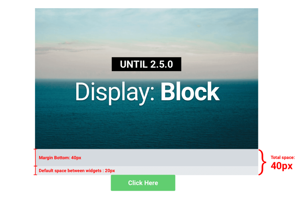
Until v2.5.0, the ` display: block` method set the default spacing between all widgets to 20px, and if you had set a different value, let’s say 40px, per widget – the larger value was added and displayed.

What does it mean for me, the user?
Most users were not affected by this update. We have just rolled out a new version 2.5.4 which fixes possible ‘extra spacing’ issues that some users faced.
The main issues happened because of a particular use of ‘ margin-bottom‘ that cause the disrupted spacing.
For users who already used the advanced inline option from v2.5 on pages, and came across these issues, go ahead and edit the page with Elementor, then save it again.
This behavior was due to the “Collapsing Margins”. Read more here.
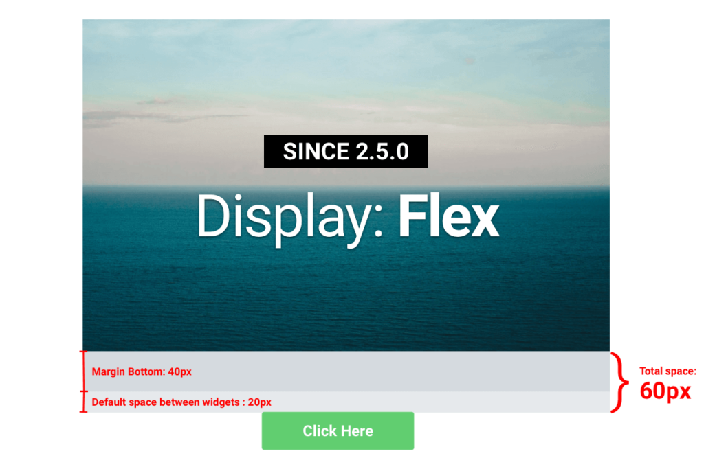
Now, if you will edit an existing page or create a new one, the calculation of the margins will be summed and not relate just to the higher value.
Let’s use our previous example:
– Space between widgets: 20px
– Margin-bottom on specific widget: 40px
In this new method, the value of the margins will be summed and will set to be 60px.

This may affect your website, only if you edit existing pages that were created before v2.5.0. Your newly created pages will use the flexbox rules.
Important! We strongly recommend you to review your website before hitting the Publish button and make sure all of your spacings are correct.
