Set the style and layout of the WooCommerce Archive Products
Content
Content
- Allow Order: Select Yes to give users the option to sort the products by Default, Popularity, Rating, Latest, Price: Low to High, or Price: High to Low
- Show Result Count: Select Yes to show number of results for this archive, or No to hide it
Advanced
- Nothing Found Message: Enter the text or use a Dynamic Tag for the message to be shown to users when there are no results to display
Style
Products
- Columns Gap: Set the exact gap between the columns
- Rows Gap: Set the exact gap between the rows
- Alignment: Align the products data to the left, right, or center
Image
- Border Type: Select the type of border, choosing from none, solid, double, dotted, dashed, or grooved
- Border Radius: Set the radius to control corner roundness of the border
- Spacing: Adjust the amount of space between the images and their data
Title
- Color: Choose the product Title color
- Typography: Set the typography options for the Title text
- Spacing: Adjust the amount of space after the Title
Rating
- Star Color: Choose the color of a filled star
- Empty Star Color: Choose the color of an empty star
- Star Size: Set the size of stars
- Spacing: Adjust the amount of space after the Rating Stars
Price
- Color: Choose the color of the product Price
- Typography: Set the typography options for the product Price
Regular price
- Color: Choose the color of the product’s Regular Price
- Typography: Set the typography options for the product’s Regular Price
Button
Normal | Hover
The following options can be set independently for both the normal and hover states.
- Text Color: Choose the color of the product’s Button Text
- Background Color: Choose the background color of the product’s Button
- Border Color: Choose the border color of the product’s Button
- Typography: Set the typography options for the product’s Button Text
- Border Type: Select the type of border, choosing from none, solid, double, dotted, dashed, or grooved
- Width: Control the thickness of the border around the product’s Button
- Border Radius: Control corner roundness of the button’s border
- Text Padding: Set the padding within the button
- Spacing: Adjust the amount of space above the buttons
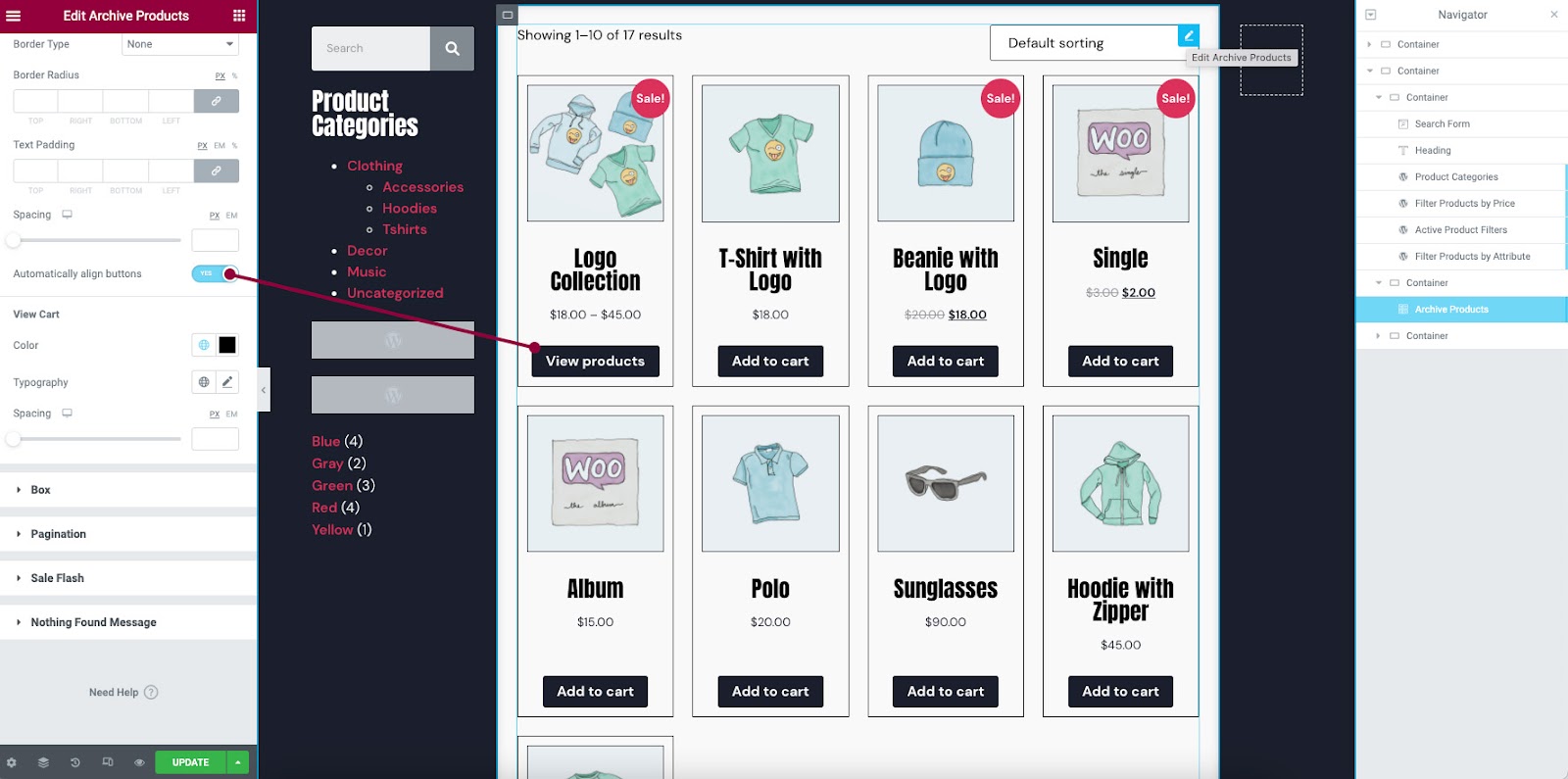
- Automatically Align Buttons: By toggling this on, the buttons will be aligned to the bottom of the wrapper. This allows for button alignment when product titles wrap to additional lines.
View Cart
- Color: Choose the color of the View Cart text under the buttons
- Typography: Set the typography options for the View Cart text
Box
- Border Width: Control the thickness of the border around the product’s box
- Border Radius: Control corner roundness of the products box
- Padding: Change the padding within the products box
Normal | Hover
The following options can be set independently for both the normal and hover states.
- Box Shadow: Adjust box shadow options
- Background Color: Choose the background color of the products box
- Border Color: Choose the border color of the products box
Pagination
- Spacing: Set the amount of space above the pagination
- Border: Show or Hide border around pagination
- Border Color: Choose the color of the pagination border
- Padding: Set the padding within the pagination
Normal | Hover | Active
The following options can be set independently for the normal, hover, and active states.
- Typography: Set the typography options for the pagination text
- Color: Choose the color of the pagination text
- Background Color: Choose the background color for the pagination
Sale Flash
- Sale Flash: Show or Hide
- Text Color: Choose the color of the Sale Flash text
- Background Color: Choose the background color of the Sale Flash
- Typography: Set the typography options for the Sale Flash text
- Border Radius: Control the corner roundness of the Sale Flash
- Width: Control the thickness of the border for the Sale Flash
- Height: Set the height of the Sale Flash
- Position: Set the position of the Sale Flash, Left or Right, of the products box
- Distance: Set the distance of the Sale Flash from the top of the products box
Nothing Found Message
- Color: Choose the color of the Nothing Found Message text
- Typography: Set the typography options for the message text
Note: The style of this widget is often affected by your theme and plugins. If you experience any such issue, try to switch to a basic theme and deactivate related plugins, or adjust the styling within your theme’s settings.