Breakpoints are used when designing your website to be responsive across all devices. Breakpoints use an additional set of CSS rules to apply to elements based on the width of the screen. For example, a Heading could be displayed at 55px for desktop, 34px for tablet, or 21px for mobile. Additional breakpoints may sometimes be needed for your design as well. We can now manage these Additional Breakpoints in the Site Settings.
Additional Breakpoints is a stable experiment and is active by default on new websites.
Let’s Get Started
Learn how to manage your Additional Breakpoints in the document below. In order to use the Additional Breakpoints feature, you may need to navigate to Elementor > Settings > Features and set it to Active. This feature will be active on new installs.
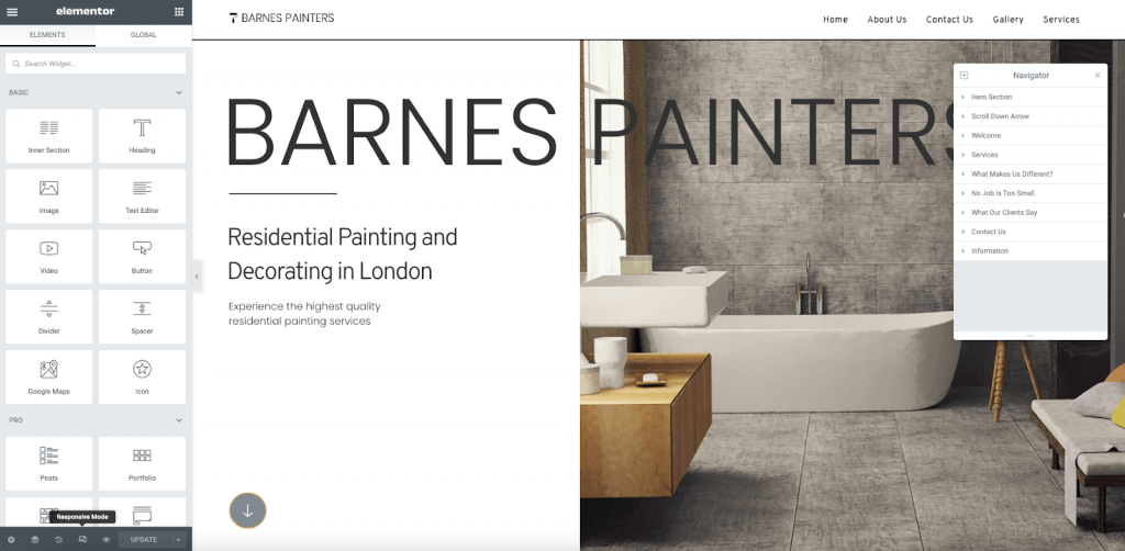
Responsive Mode Editor
To enter the Responsive Mode Editor, navigate to the lower corner of your editor panel and click the responsive mode icon. This will load the responsive modes. These will additionally load on any responsive controls in the editor.
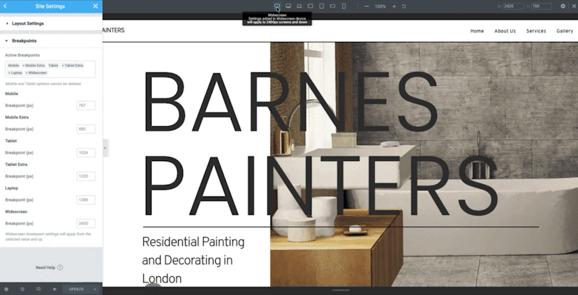
Manage BreakPoints
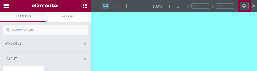
To open the breakpoint editor, you may click the gear icon located in the top corner of your screen.
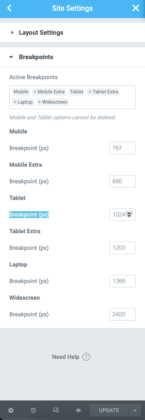
You can also open the breakpoint editor by opening Site Settings>Layout>Breakpoints.
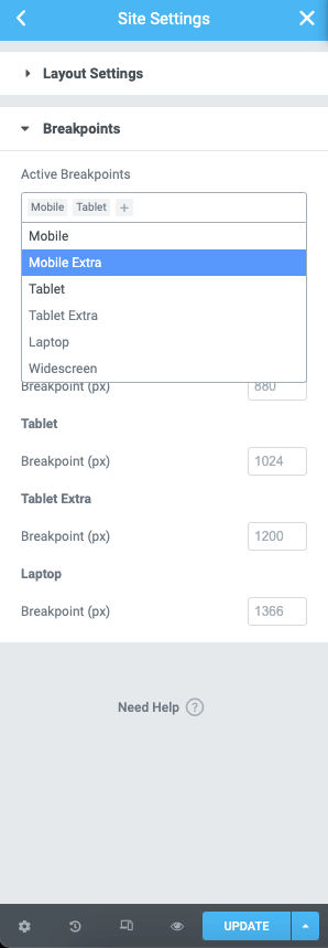
Adding Additional Breakpoints
To add breakpoints, click the + icon in the active breakpoints control. A dropdown list will appear with the additional options.
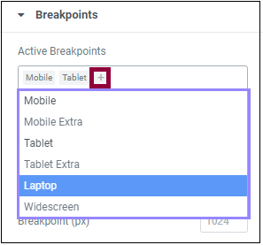
Select a device name to add a breakpoint.
After you’ve added a custom breakpoint, you use the “x” icon to remove it.
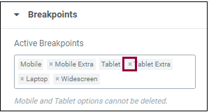
Note: The default Mobile and Tablet modes cannot be removed.
Editing The Breakpoint Values
You may edit the values needed for each Breakpoint by typing the value or using the up and down arrows.
Reload The Editor
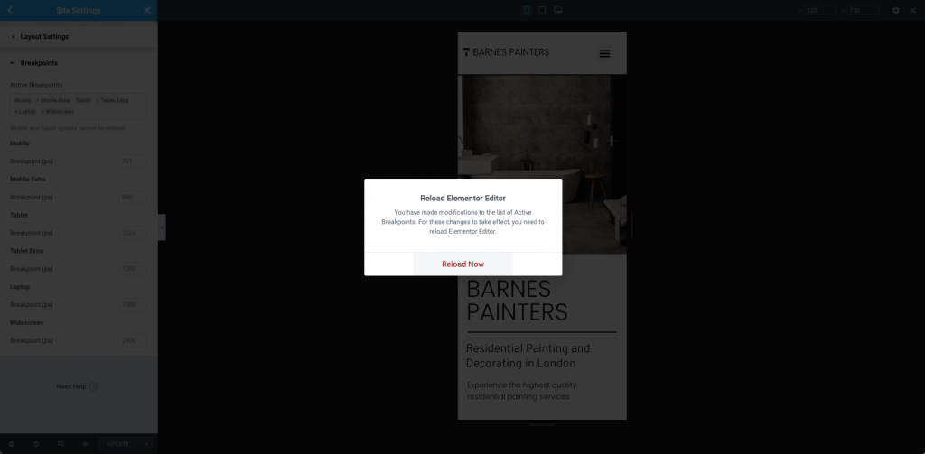
Once you have set the Breakpoint options for your project, click the blue Save button in the Site Settings. A popup will appear to notify you that the page will need to reload for the new Breakpoints to appear. Click the Reload Now link.
Using Additional Breakpoints
You will now be able to use the responsive mode editor. Click the icons at the top of the screen to see how your Elementor design will appear on each Breakpoint width. Use the zoom level to preview for accessibility. You may also drag the horizontal and vertical handles to resize your preview.
Using Cascading Responsive Values
Elementor uses a cascading concept across breakpoints, which means that changes cascade down. Changes you make on a larger breakpoint cascade down to the smaller breakpoint, but this will not work vise versa; Changes to a smaller breakpoint won’t affect the higher breakpoint unless you’re designing for widescreens. In this case, Elementor is cascading up, making the Desktop device the default breakpoint. Learn more about inherited values here.