Introduction
Elementor is a powerful site and page builder that allows you to create beautiful websites efficiently. That said, you do have to abide by some rules of website form and function.
You’ll want to keep page elements designated to certain places, and Elementor allows you to do this using its visual Editor.
In this article, we’ll go over the Elementor Layout. Let’s get started!
Web design vs. design
Elementor was designed to build web pages, which means it is different from design software. That means that you can’t simply drag and drop elements wherever you want.
These Elements must fit into the standardized constraints of a web page.
Why do web pages need to be standardized?
Some people use desktops and laptops, while others prefer to use smartphones and tablets. There are people who prefer Google Chrome, while others prefer Firefox and Safari, and other browsers.
With an estimated 6 billion people having access to the internet, there are a lot of different configurations each site must take into account and standardization is the best way to make sure sites can reach as many people as possible.


Standardizing web pages means any browser can read them. It also has two other benefits – optimization and responsiveness. Responsiveness is a measure of how well your site responds to different screen sizes – looking just as good on a mobile phone as it does on a widescreen TV. Optimization is a reflection of how quickly your pages load.
This is why Elementor ensures that the web pages you build are within the constraints of these standards.
Why is page speed important?
Page speed is important from a technical point-of-view. It’s also important for increasing your web traffic and, more importantly, keeping visitors on your website.
People don’t want to wait for a web page to load.
We won’t get into marketing jargon like bounce rates, engagement, and conversion rates. The bottom line is: if your business relies on your website, you need to optimize it so you don’t lose customers.
How are pages laid out in Elementor?
Imagine your web page as a grid. If you think about it, a grid is not just a symmetrical cluster of squares, but rather the intersection of vertical and horizontal planes. Therefore, think of Sections as the rows (horizontal) while Columns are of course the vertical part.
It’s best practice to build your website by using Sections to divide your website into slices.

Next, you want to organize the elements and content within those Sections into Columns so that they’re easier to present.

Lay out the Layer Cake!
Now that you’ve learned why the Elementor layout is the way it is, I hope you can have fun creating your delicious website!
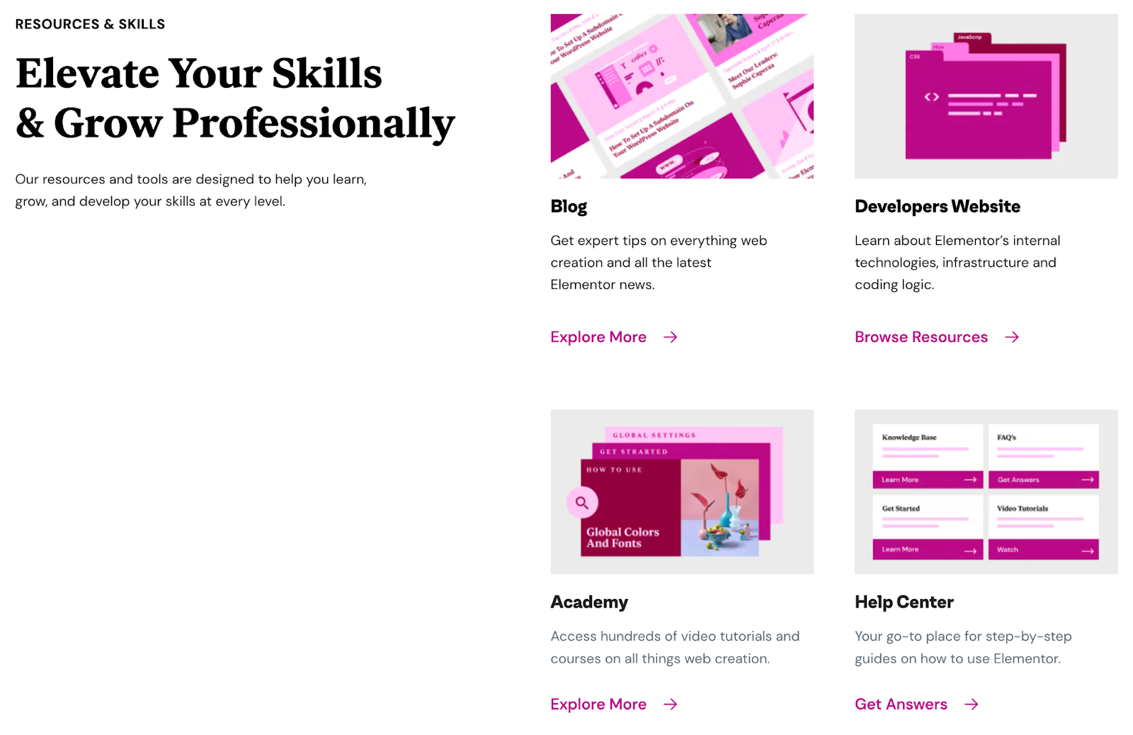
To get the best out of Elementor, head over to the Elementor Academy for more learning resources. If you have any issues or need help, please contact our Support Center.
