Note: For Elementor 3.15 and above:
- If you activate the nested elements experiment, the new Accordion widget incorporates the capabilities of Toggle widget and replaces it. This means the Toggle widget will no longer be available. Existing toggles are unaffected by this change and they can still be edited.
- if you activate the nested elements experiment, the default Accordion widget is replaced with a new Accordion widget which can include nested elements. For more details see, Add elements to your Accordion widgets.
The Accordion Widget is used to display text in a collapsed, condensed manner, letting you save space while still presenting an abundance of content.
With the Accordion, site visitors can scan item titles, and choose to expand an item.
The Accordion is similar to the Toggle widget, but there are two main differences:
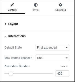
- When a page is loaded, the first item of the Accordion widget is expanded, while all other items remain collapsed. With the Toggle widget, however, all items are collapsed when a page is first loaded.
- Only one item of an Accordion can be expanded at a time. When you expand an Accordion item, the previously opened item automatically collapses. With the Toggle widget, however, visitors can open as many items as they want.
Content
Accordion
| Accordion Items Title & Content: | Enter the title and description for each item. |
| Add Item | : Add more accordion items to the list. |
| Icon | Select the icon to represent the action of expanding an item. Choose either None, Upload SVG, or select an icon from the Icon Library. If Icon Library is chosen, a Recommended tab is displayed in the Library which shows recommended icons to represent the expanding concept. |
| Active Icon | Select the icon to represent the action of collapsing the active item. Choose either None, Upload SVG, or select an icon from the Icon Library. If Icon Library is chosen, a Recommended tab is displayed in the Library which shows recommended icons to represent the collapsing concept. |
| Title HTML Tag | Set the HTML tag used for the title to H1- H6 or DIV. |
| FAQ Schema | Use the toggle to enable or disable the option to use schema |
| Limitation | This option can only be enabled for one widget per page. |
Style
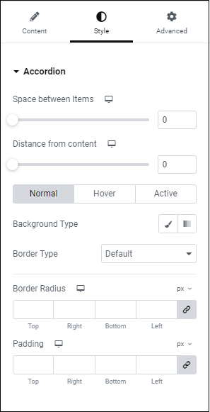
Accordion
| Border Width | Set the thickness of the border around the accordion and between each item |
| Border Color | Choose the color of the border around the accordion and between each item |
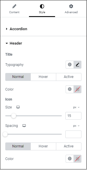
Title
| Background | : Choose the color of the title’s background |
| Color | Choose the color of the non-active titles’ text |
| Active Color | Choose the color of the active title’s text |
| Typography | Set the typography options for the titles |
| Padding | Set the padding for the titles |
Icon
| Alignment | Align the icon to the left or right of the title |
| Color | Choose the color of the icons |
| Active Color | Choose the color of the active icon |
| Spacing | Control the spacing between the icon and the title |
Content
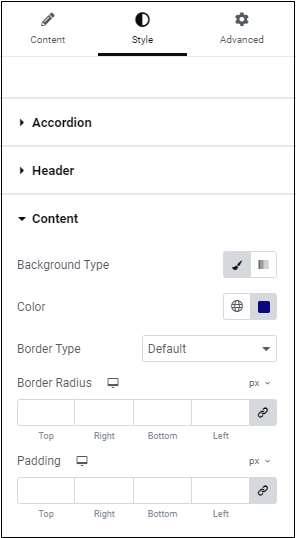
| Background | Choose the background color of the content |
| Color | Choose the text color of the content |
| Typography | Set the typography options for the content |
| Padding | Set the padding for the content |
Advanced
Set the Advanced options that are applicable to this widget
Add elements to your Accordion widgets
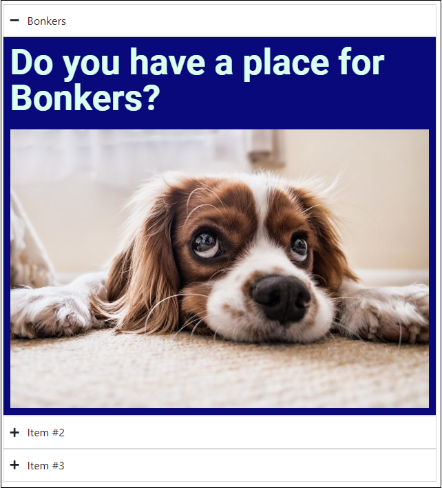
If you are using the Nested Elements experimental feature, the Accordion widget is automatically upgraded to include nested elements. This allows you to add elements such as images and buttons to your Accordions. The new Accordion widget incorporates the features of the Toggle widget so the Toggle widget is no longer available.
Note: Existing Accordion and Toggle widgets are unaffected by this change. You will be able to edit them using the previous options.
Important: The Accordion widget is not compatible with the Loop widget because nested elements do not work with repetitive elements.
Creating an Accordion with nested elements
To create an Accordion widget with nested elements:
- Add the Accordion widget to the canvas. See Add elements to a page for details.
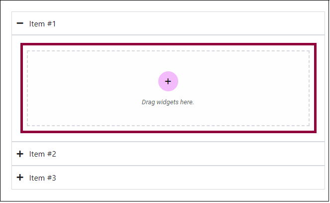
- On the canvas, by default, the Accordion widget appears with Item #1 expanded. It automatically includes a built-in container. Every item has a container already built-in.
- Add elements to the empty container.
Note: Containers are an element, therefore you can add more containers to the built-in container.
Accordion settings (with nested elements)
Content tab – Layout
In the Content tab, expand the Layout section to determine the number of tabs and their titles.
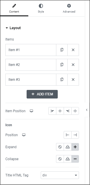
Each tab of the Accordion is an item. Click an item to edit it. Editing the item allows you to:
- Change the name
- Give the tab a CSS ID. For more details, see CSS selectors in Elementor.
Click to add a new tab.
Determines where the tab’s name will appear.
By default, an icon appears next to the tab’s name. Visitors click this icon to expand and collapse the tab.
Determine the place the icon: on the left or right of the tab name.
Provides three options for the icon that opens the tab:
-
 Select not to use an icon
 -
 Upload an SVG file to use as an icon. See Enable SVG support..
 -
 Choose an icon from the icon library.
Provides three options for the icon that opens the tab:
- Select not to use an icon
- Upload an SVG file to use as an icon.
-
 Choose an icon from the icon library. See Enable SVG support.
Use the dropdown menu to designate the title of the price list as a header (H1-6). This helps search engines find and understand the price list, boosting SEO. The title can also be tagged as a paragraph, span or div.