Note: For Elementor 3.15, if you activate the nested elements experiment, the new Accordion widget incorporates the capabilities of Toggle widget and replaces it. This means the Toggle widget will no longer be available. Existing toggles are unaffected by this change and they can still be edited.
The Toggle Widget lets you create text boxes that are collapsed, so the visitor only sees the titles of each text box item. This lets you show your content in a condensed form, so visitors don’t have to scroll through a long page and can sift through the titles easily.
The Toggle widget is similar to the Accordion widget with two main differences:
- When a page is loaded, all Toggle widget items are collapsed. With the Accordion widget, however, the first item is expanded, while all other items remain collapsed.
- With the Toggle widget, visitors can expand as many items as they like. With the Accordion widget they are limited to only expanding one item at a time.
Content
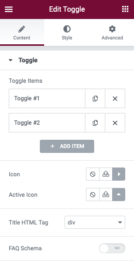
Toggle
- Toggle ItemsTitle & Content: Enter the title and description for each item
- Add Item: Use the ‘Add Item’ button to add more toggle items to the list.
- Icon: Select the icon to represent the action of expanding an item. Choose either None, Upload SVG, or select an icon from the Icon Library. If Icon Library is chosen, a Recommended tab is shown in the Library which shows recommended icons to represent the expanding concept.
- Active Icon: Select the icon to represent the action of collapsing the active item. Choose either None, Upload SVG, or select an icon from the Icon Library. If Icon Library is chosen, a Recommended tab is shown in the Library which shows recommended icons to represent the collapsing concept.
- Title HTML Tag: Set the HTML tag used for the title to H1- H6 or DIV
- FAQ Schema: Use the toggle to enable or disable the option to use schema
Note: Only one widget per page can have this option enabled.
Style
Toggle
- Border Width: Set the thickness of the border around the toggle widget and between each item
- Border Color: Choose the color of the border around the toggle widget and between each item
- Space Between: Set the amount of space between each item
- Box Shadow: Set the box shadow around the toggle widget, or around each item if there is space between each. You can adjust the box shadow’s Color, Horizontal position, Vertical position, Blur, and Spread as well as the shadow’s Position, which can be either Inset or Outline
Title
- Background: Choose the color of the title’s background
- Color: Choose the color of the non-active titles’ text
- Active Color: Choose the color of the active title’s text
- Typography: Set the typography options for the titles
- Padding: Set the padding for the titles
Icon
- Alignment: Align the icon to the left or right of the title
- Color: Choose the color of the icons
- Active Color: Choose the color of the active icon
- Spacing: Control the spacing between the icon and the title
Content
- Background: Choose the background color of the content
- Color: Choose the text color of the content
- Typography: Set the typography options for the content
- Padding: Set the padding for the content
Advanced
Set the Advanced options that are applicable to this widget