The Icon widget is useful for displaying FontAwesome icons in numerous styles on your page.
There are 3 different views for the widget: Default, Stacked, and Framed.
If Default view is chosen, the following options are available:
Content
- Icon: Choose from a list of Font Awesome icons
- View: Choose between default, stacked or framed
- Link: Enter the URL for the item’s link. Click the Link Options
 cog to either add rel=nofollow to the link or to open the link in a new window.
 - Alignment: Align the icon to left, center or right.
Style
Icon
Normal
- Primary: Choose the main and secondary colors for the icon
- Size: Increase or decrease the size of the icon
- Rotate: Rotate the icon
Hover
- Primary Color: Set colors for the hover
- Hover Animation: Set any animation for the hover state
- Size: Set the exact size of the icon
- Rotate: Rotate the icon up to 360 degrees
If Stacked or Framed view is chosen, the following options are available:
Content
- Icon: Choose from a list of Font Awesome icons or upload an SVG icon
- View: Choose between default, stacked or framed
- Shape: Choose the shape of the stack or frame, either Circle or Square
- Link: Enter the URL for the item’s link. Click the Link Options cog to either add rel=nofollow to the link or to open the link in a new window.
- Alignment: Align the icon to left, center or right.
Style
Icon
Normal
- Primary Color: Choose the primary color (the background or frame) color for the icon
- Secondary Color: Choose the secondary color, which is the color of the icon itself
- Padding: Set the padding around the icon to control the size of the stack or frame
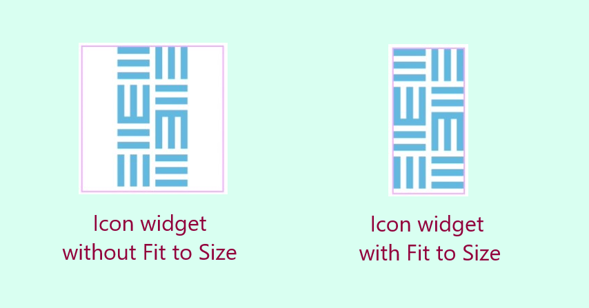
- Size: Set the size of the icon. By default, icons are square, which means non-square icons have empty space surrounding them. To prevent this, when you upload an SVG image, enable the option Fit to Size.
- Rotate: Rotate the icon up to 360 degrees
- Border Radius: Set the border radius to control the corner roundness of the stack or frame
Hover
- Primary Color: Choose the primary color (the background or frame) color for the icon
- Secondary Color: Choose the secondary color, which is the color of the icon itself
- Hover Animation: Choose an animation effect when hovering over the icon, such as Grow, Pulse, Skew, etc.
- Padding: Set the padding around the icon to control the size of the stack or frame
- Size: Set the size of the icon.
- Rotate: Rotate the icon up to 360 degrees
- Border Radius: Set the border radius to control the corner roundness of the stack or frame