The Login Widget makes it easy to create a custom login page, instead of the default WordPress login page.
How to add a login page to WordPress
Create a New Page, and add the Login Widget
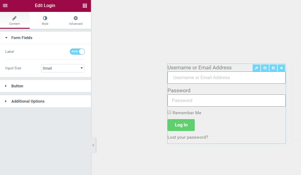
Form fields
- Label: Show or Hide the form Label
- Input size: Choose the Form Fields input size.
Button
- Text: Type the button’s text. You may also use the Dynamic Tags feature to call from the site’s metadata or custom field
- Size: Choose the size of the button
- Alignment: Set the button’s alignment
Additional options
- Redirect After Login: Set to ON or OFF.
- Lost Your Password: Choose whether or not to display the “Lost Your Password” link
- Remember me: Choose whether or not to display the “Remember Me” checkbox
- Logged in message: Choose whether or not to display the a Logged In user a message
- Custom label: Change the default form label and placeholder text
- Username Label: If Custom is selected, enter a text value or use dynamic tags in the field
- Password Label: If Custom is selected, enter a text value or use dynamic tags in the field
Style
Form
- Rows Gap: Set the exact gap between each row
- Links Color: Choose the color of the links
- Links Hover Color: Choose the color of the links when hovered over
Label
- Spacing: Set the exact gap between the label and its corresponding field
- Text Color: Choose the color of the label text
- Typography: Set the typography options for the label text
Fields
- Text Color: Choose the color of the text within the fields
- Typography: Set the typography options for the text within the fields
- Background Color: Choose the background color of the fields
- Border Color: Choose the border color of the fields
- Border Width: Set the thickness of the border around the fields
- Border Radius: Set the border radius to control corner roundness of the fields
Button
Normal | Hover
The following options can be set independently for both the normal and hover states.
- Text Color: Choose the color of the button’s text
- Typography: Set the typography options for the button’s text
- Background Color: Choose the background color of the button
- Border Type: Select the type of border, choosing from none, solid, double, dotted, dashed, or grooved
- Border Radius: Set the border radius to control corner roundness of the button
- Text Padding: Set the amount of padding around each side of the text in the button
Advanced
Set the Advanced options that are applicable to this widget
Note: Use your regular WordPress login credentials with the Login Widget