The Media Carousel widget allows you to create a slider of videos and images.
The widget includes 3 skins:
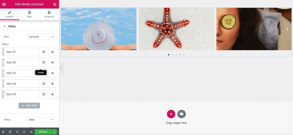
- Carousel is the standard rotating carousel skin that shows a customized number of image or video slides per view.
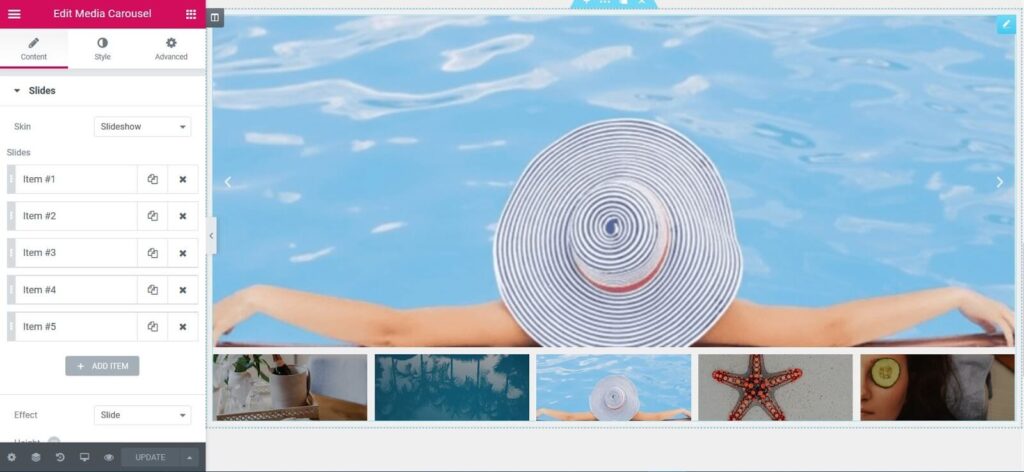
- Slideshow is a slider skin that displays one primary slide and small image thumbnails below.
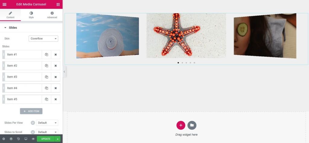
- Coverflow is a slider skin that shows a central slide in the front and two side slides in the back.
Slides

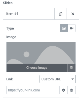
Inside each slide, you can add the image or video, and have it link to its media file or an external link. The carousel can display a mixture of both images and videos at once. You may also use Dynamic Tags such as WooCommerce products, post images, or custom fields by clicking the stack icon.
If you have Lightbox enabled, this will also be available for this widget.
The Media Carousel widget also has options for optimal display on mobile devices.
Carousel Skin

Content
Slides
- Skin: Carousel
- Slides: Choose the image or video to display and set the URL to link to
- Effect: Choose how each slide transitions, either Slide, Fade, or Cube
- Slides Per View: Set number of slides to view at one time, maximum of 10
- Slides to Scroll: Set number of slides to scroll per swipe, maximum of 10
- Height: Set the height of the carousel
- Width: Set the width of the carousel
Additional Options
- Arrows: Choose to show or hide the navigation arrows
- Pagination: Select None, Dots, Fraction, or Progress
- Transition Duration: Set the time it takes for each slide to appear. This time is in milliseconds, so 1000 ms is equal to 1 second.
- Autoplay: Show or hide
- Autoplay Speed: Set the time between each slide. This time is in milliseconds, so 1000 ms is equal to 1 second.
- Infinite Loop: Show carousel in continuous loop, infinitely. Yes or No
- Pause on Interaction: Select whether or not to pause autoplay when a user interacts with the carousel. Yes or No
- Overlay: Select overlay type, when user hovers over a slide. None, Text, or Icon
- Image Size: Select size of image, from Thumbnail to Full, or Custom
- Image Fit: Select how image fits into its container, either Cover, Contain, or Auto
- Lazy Load: Toggle to enable lazy loading of the images.
Slideshow Skin

Content
- Skin: Slideshow
- Slides: Choose the image or video to display and set the URL to link to
- Effect: Choose how each slide transitions, either Slide, Fade, or Cube
- Height: Set the height of the carousel
- Thumbnails:
Slides Per View: Number of slides, per view, maximum of 10
Ratio: Select from 1:1, 4:3, 16:9, or 21:9
Additional Options
- Arrows: Choose to show or hide the navigation arrows
- Transition Duration: Set the time it takes for each slide to appear. This time is in milliseconds, so 1000 ms is equal to 1 second
- Autoplay: Show or hide
- Autoplay Speed: Set the time between each slide. This time is in milliseconds, so 1000 ms is equal to 1 second
- Infinite Loop: Show carousel in continuous loop, infinitely. Yes or No
- Pause on Interaction: Select whether or not to pause autoplay when a user interacts with the carousel. Yes or No
- Image Size: Select size of image, from Thumbnail to Full, or Custom
- Image Fit: Select how image fits into its container, either Cover, Contain, or Auto
- Lazy Load: Toggle to enable lazy loading of the images.
Coverflow Skin

Content
- Skin: Coverflow
- Slides: Choose the image or video to display and set the URL to link to
- Slides Per View: Set number of slides to view at one time, maximum of 10
- Slides to Scroll: Set number of slides to scroll per swipe, maximum of 10
- Height: Set the height of the carousel
- Width: Set the width of the carousel
Additional Options
- Arrows: Choose to show or hide the navigation arrows
- Pagination: Select None, Dots, Fraction, or Progress
- Transition Duration: Set the time it takes for each slide to appear. This time is in milliseconds, so 1000 ms is equal to 1 second.
- Autoplay: Show or hide
- Autoplay Speed: Set the time between each slide. This time is in milliseconds, so 1000 ms is equal to 1 second.
- Infinite Loop: Show carousel in continuous loop, infinitely. Yes or No
- Pause on Interaction: Select whether or not to pause autoplay when a user interacts with the carousel. Yes or No
- Overlay: None, Text, or Icon
- If Text is chosen:
Caption: Choose which text to display as the caption – Title, Caption, or Description
Animation: Choose from Fade, Slide Up, Slide Down, Slide Right, Slide Left, Zoom In - If Icon is chosen:
Icon: Choose from a search icon, plus icon, eye icon, or link icon - Animation: Choose from Fade, Slide Up, Slide Down, Slide Right, Slide Left, Zoom In
- Image Size: Select size of image, from Thumbnail to Full, or Custom
- Image Fit: Select how image fits into its container, either Cover, Contain, or Auto
- Lazy Load: Toggle to enable lazy loading of the images.
Style
Slides
- Space Between: Set the space between slides
- Background Color: Choose a background color for the carousel
- Border Size: Control the thickness of the border
- Border Color: Choose a color for the border
- Padding: Set the padding
- Border Radius: Set the border radius to control corner roundness
Navigation
Arrows
- Size: Scale arrow size up or down
- Color: Choose the color for the arrows
Pagination (not available on Slideshow type)
- Position: Place pagination outside or inside of slides
- Size: Scale pagination size up or down
- Color: Set the color of the pagination
Play Icon (You must have videos in the slides to see it)
- Color: Set the color of the video play icon
- Size: Set the size of the video play icon
- Text Shadow: Set the text shadow of the video play icon
Overlay (not available on Slideshow type)
If Text was chosen for the Overlay:
- Background Color: Choose a background color for the overlay
- Text Color: Choose the color of the overlay text
- Typography: Change the typography options for the overlay text
If Icon was chosen for Overlay:
- Background Color: Choose a background color for the overlay
- Text Color: Choose the color of the overlay icon
- Icon Size: Scale the size of the overlay icon up or down
Lightbox
- Color: Choose the lightbox background color
- UI Color: Choose the UI Color. This affects the lightbox arrow and dot navigations and the X closing icon.
- UI Hover Color: Choose the UI hover color. This affects the lightbox arrow and dot navigations and the X closing icon when the user hovers over each.
- Video Width: Set the width of the video
Note: Autoplay is affected by Google’s Autoplay policy on Chrome browsers.
Note: Using Elementor template shortcodes within the widget may sometimes work, but it is not a supported feature.
Advanced
Set the Advanced options that are applicable to this widget
Read the full release post about the Media Carousel Widget
