The Table of Contents widget automatically organizes your page content based on H1 through H6 levels of hierarchy. Although the process is automatic, you have plenty of control over what gets included and what gets excluded from the display.
Content
Table of Contents
Title: Type the heading text shown above the Table of Contents
HTML Tag: Select the HTML tag to use for the title, from H2 to H6, or div
Include | Exclude
Include
Anchors By Tags: Click to select the page’s H1-H6 tags to be automatically included
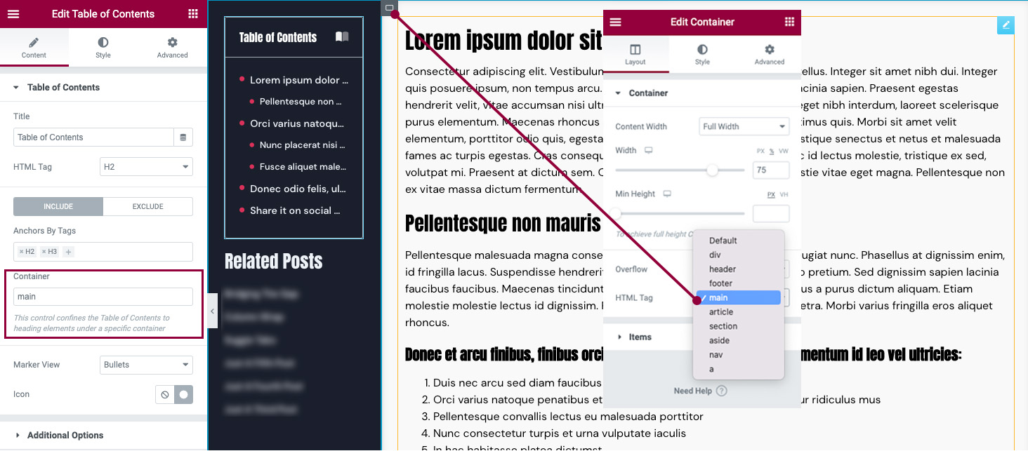
Container: This control confines the Table of Contents to heading elements under a specific container.
Example: Set the HTML wrapper of the Container that your content resides in to “Main.” Then, in your Table of Contents widget use “main” in the Include field.
If creating a Single Post or Page template, this will be the Container that your Post Content widget resides in. All new posts/pages will use the TOC for headings in the WordPress or Elementor content. This is the best use for the feature as it will not display any other headings in the template.

Exclude
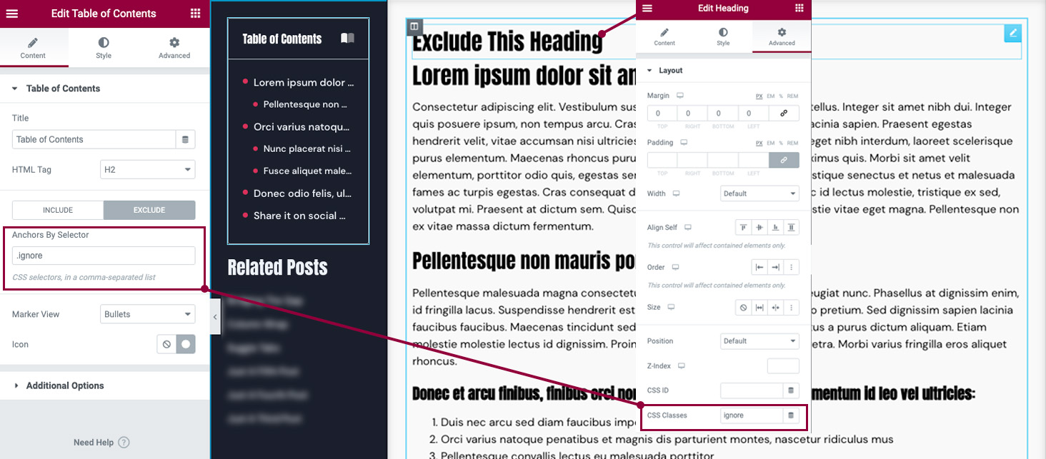
Anchors By Selector: Enter CSS selectors to be excluded, in a comma-separated list
Example: If you wish to hide the contents of a widget or container from the Table of Contents enter a CSS Class name that you wish to exclude (example: .ignore). Then in any Container or Widget’s Advanced Tab, add the CSS Class name without the “.” (example: ignore).
Note: You must refresh the editor or preview the changes in a new tab to see the change reflected.

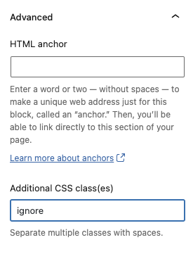
Exclude WordPress headings
If you have used the Table of Contents widget in your Single Post or Page template and wish to hide a WordPress heading or block, you may do so using the exclude CSS Class in the Block’s Advanced settings.

Marker View: Choose to display numbers or bullets next to list items
Icon: (only available if Marker View is set to Bullets). Click the Icon Library to choose an icon or click None to not use any bullet icon.
Additional Options
Word Wrap: Slide to Yes to turn Word Wrap on, to wrap text when column width cannot accommodate long text on one line
Minimize Box: Slide to No to display Table of Contents fully expanded or Yes to force a click to expand a minimized Table of Contents box
Icon: Click the Icon Library to choose an icon from the Icon Library that will display when the widget is minimized to indicate the user should click to expand the widget. Click None to not display an icon. Click Upload SVG to upload your own SVG icon.
Minimize Icon: Click the Icon Library to choose an icon from the Icon Library that will display when the widget is fully expanded to indicate the user should click to minimize the widget. Click None to not display an icon. Click Upload SVG to upload your own SVG icon.
Minimized On (only available if Minimize Box is set to Yes): Select to minimize on Desktop, Mobile, Tablet, or None
Hierarchical View: Slide to Yes to display list items with indention based on Tag hierarchy
Collapse Subitems: (only available if Hierarchical View is set to Yes) The “Collapse” option should only be used if the Table of Contents is made sticky. Slide to Yes to collapse nested lists and only show top level items

Style
Box
Background Color: Choose a background color for the entire Table of Contents box
Border Color: Choose a color for the box’s border
Loader Color: Choose a color for the loader spinner
Border Width: Set the width of the box’s border
Border Radius: Set the border radius to control corner roundness
Padding: Change the padding settings of the widget
Min Height: Set the minimum height of the widget
Box Shadow: Set the box shadow options
Header
Background Color: Choose a background color for the header
Text Color: Choose a color for the text of the header
Typography: Change the typography options for the header text
Icon Color: Choose the color of the Expand / Minimize icon
Separator Width: Set the thickness of the widget header’s bottom border
List
Typography: Change the typography options for the text of the anchors
Indent: Set the amount of indentation for the anchors
Normal | Hover | Active
The following options can be set independently for the normal, hover, and active states.
Text Color: Choose a color for the anchor text
Underline: Select Yes to underline the anchor text
Marker
Color: Choose a color for the marker
Size: Change the size of marker if you wish it to be a different size than the text
