Carousel Widget

Carousels are a great way to present your visitors with a lot of information while taking up a small amount of real estate. The Carousel widget, allows you to use nested elements to design your own unique carousels. 

Note: The carousel widget is currently an experimental feature and must be activated to use. 

Prerequisite: In order to use the Carousel widget, make sure the following features are active:

  • Flexbox Containers
  • Nested Elements

Create a carousel

To create a carousel:

  1. Create a new page or edit an existing page.
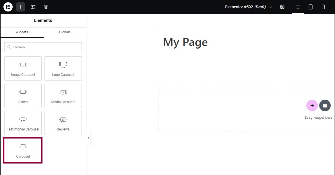
  2. From the Widgets panel, drag the Carousel widget to the canvas.

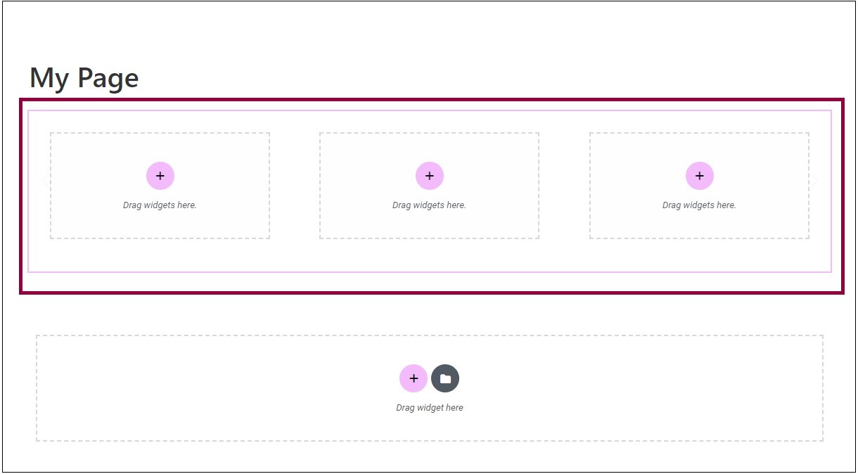
A carousel containing three horizontal slides is created. Each of these slides has one container.   You can now add elements to these containers to build your own carousel.

Learn how to work with containers

Note: Do not add a carousel inside a carousel as it may affect the functionality.

Add more slides to your carousel

The advantage of using a  carousel is that it can display a lot of information in a small area. This is done by using multiple slides.

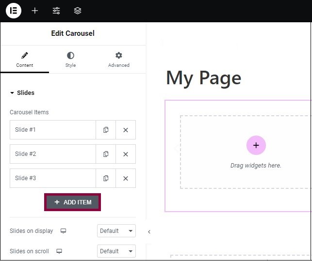
To add more slides to your carousel:

  1. Go to the Content tab.
  2. Click Add Item.

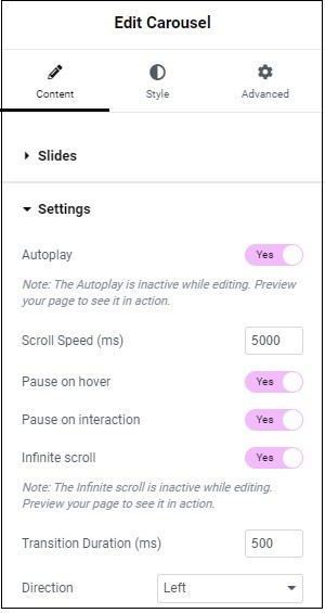
Carousel widget settings

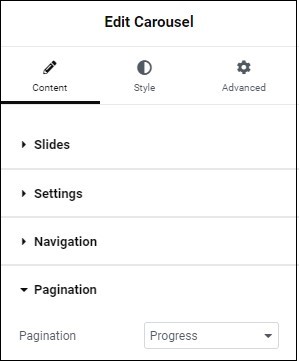
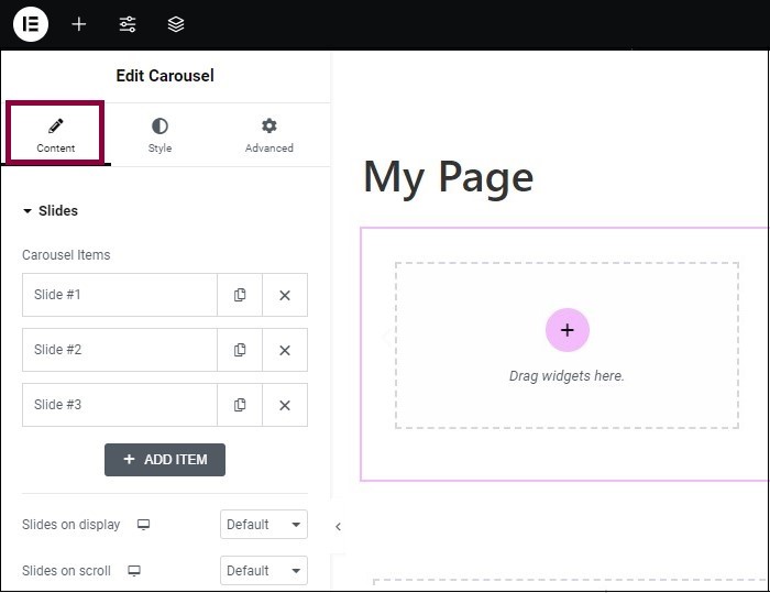
Content tab – Slides

In the Content tab, expand the Slides section to configure what appears in your carousel’s slides.

Slides that make up the carousel. 

  • Click the copy icon () to copy a slide.
  • Click the delete icon () to delete a slide.

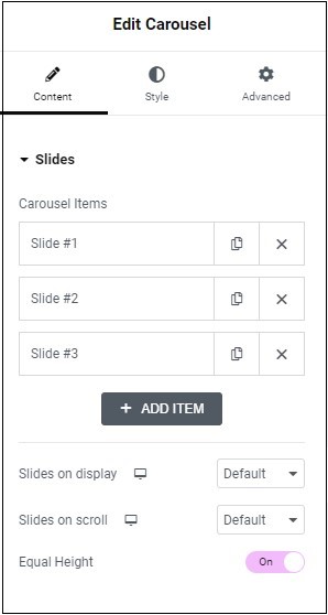
Controls the number of slides visible to visitors. 

  • Use the dropdown to determine the number of slides visible. 
  • Keep in mind that the more slides you add, the smaller each slide will be.

Add another slide.

Use the dropdown to determine the number of slides that will move when visitors click the navigation icon.

Determines whether all slides will be equal in height.

Content tab - Settings


In the Content tab, expand the Settings section to determine the functionality of the slides, such as enabling automatic progression from one slide to another. 

The carousels scrolls automatically while visitors are viewing the page.Toggle Autoplay to turn this feature off.

Determines the amount of time slides will appear on screen before autoscrolling. Measured in milliseconds. Hidden if autoplay is turned off.

Disables autoplay while visitors mouse over the carousel. Hidden if autoplay is turned off.

Disables autoplay when visitors click elements in the carousel. Hidden if autoplay is turned off.

Turn this toggle off to prevent the carousel from restarting after it reaches the last slide. 

  • Inactive while editing.
  • Only works in preview mode and on a live site.

The time it takes for one slide to replace another. Measured in milliseconds. 


Note: If you set the direction to row, a slider appears allowing you to adjust the width of the tabs in either PX or %


You can also  adjust the alignment of the text/icon tab title to the right, left or center.

  • Left: Slide 1 will be the slide located furthest to the left.
  • Right: Slide 1 will be positioned as the slide farthest to the right 

Content tab - Navigation

In the Content tab, expand the Navigation section to configure the settings to determine how visitors can manually navigate through the slides.

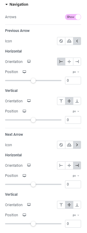
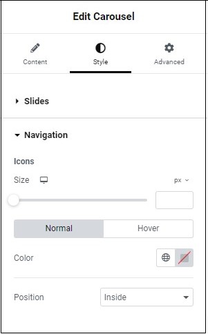
Arrows are the default navigation icon. By clicking the arrows, you manually move to the previous and next slides. 

Toggle the button to disable arrows.

Previous Arrow Icon– Replace the arrow icon used to view the previous slide:

  • Select not to display an icon 
  • Upload an SVG file to use as an icon. See Enable SVG support
  • Choose an icon from the icon library.

Orientation – Place the icon at the start, center or end of the Carousel.

Use the slider to place the navigation icon exactly where you want it. For more details, see Units of measurement.

Orientation – Place the icon at the top, center or middle of the Carousel.

Use the slider to place the navigation icon exactly where you want it.

Replace the arrow icon used to view  the previous slide with:

  • Select not to use an icon
  • Upload an SVG file to use as an icon. See Enable SVG support
  • Choose an icon from the icon library.

Orientation – Place the icon at the start, center or end of the Carousel. 

Use the slider to place the navigation icon exactly where you want it.

Content tab - Pagination

In the Content tab, expand the Pagination section to configure how many pages and slides are displayed at a time. For example, a carousel with six slides, set to display three slides at a time, would have two pages. 

Choose how to indicate the page number:

  • a series of dots
  •  a fraction 
  • a progress bar

Alternatively, you can turn the pagination off.

Style tab - Slides

In the Style tab, expand the Slides section to configure how your slides look. 

Use the slider to adjust the amount of space between slides.

Choose the background, for details, see Backgrounds.

Choose the border, for details, see Border types.

Choose the border radius, for details, see Border radius.

Add padding, for details, see Padding and margins.

Style tab - Navigation

In the Style tab, expand the Navigation section to configure how the manual navigation icons appear.

Use the slider or the counter control to adjust the size of the icons that you use to manually move to the previous and next slides. For more details, see Units of measurement.

  • Normal:  determine how the dots will appear by default. 
  • Hover: determine how the navigation  appears when you visitors mouse over them. 

Choose a color: either use the color picker or a global color.

From the menu, determine if the navigation icons appear Inside or Outside the carousel.

Style tab - Pagination

In the Style tab, expand the Pagination section to configure how the pagination appears. It changes depending on what method of pagination you use:

  • Dots
  • Fractions
  • Progress Bar

Dots

Represent the pages in your carousel by using dots positioned below the carousel.

Use the slider or the counter control to adjust the size of the dots representing the pages. For more details, see Units of measurement.

  • Normal: determine how the dots will appear by default.
  • Hover: determine how the dots appear when you mouse over them.

Choose a color: either use the color picker or a global color.

From the menu, select   whether the dots appear Outside or Inside the carousel.Spacing

Use the slider or the counter control to adjust the amount of space between the dots and the slides. For more details, see Units of measurement.

Fractions

Represent the pages in your carousel by using a fraction positioned below the carousel. For example, 3/8  indicates page three out of eight pages.

Choose how your text will appear to visitors. For details, see Typography.

Choose a color: either use the color picker or a global color.

From the menu, select  whether the fractions appear Outside or Inside the carousel.

Use the slider or the counter control to adjust the amount of space between the fractions and the slides. For more details, see Units of measurement.

Progress Bar

Represent the pages in your carousel by using a progress bar positioned below the carousel. 

 Use the slider or the counter control to adjust the width of the progress bar. For details, see Units of measurement.

  • Normal: determine how the progress bar will appear by default. 
  • Hover : determine how it will appear when visitors mouse over them. 

Choose a color: either use the color picker or a global color.

在社交網絡上分享它

今天開始使用Elemenor

加入數百萬專業人士,使用Elementor更快、更好地構建WordPress網站

本頁內容