When using the responsive editor in Elementor, inherited responsive values reflect on controls such as: padding, margins, image sizes, and every other numeric control. With each additional custom breakpoint, it is helpful to understand what exactly is being inherited from one breakpoint to another. With Elementor’s visible responsive values, you will see exactly what values were inherited.
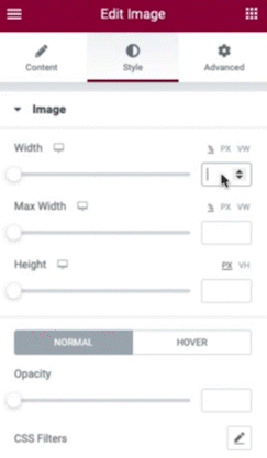
Using Inherited Responsive Values
- Select an object on your page that has responsive properties
- Enter a value to a control for desktop view
- Select another breakpoint (example: tablet). The previous value will be reflected as a greyed placeholder
- Repeat for additional breakpoints.
Cascading Responsive Values
Elementor uses a cascading concept across breakpoints, which means that changes cascade down. Changes you make on a larger breakpoint cascade down to the smaller breakpoint, but this will not work vise versa; Changes to a smaller breakpoint won’t affect the higher breakpoint unless you’re designing for widescreens. In this case, Elementor is cascading up, inheriting the Desktop value.