Page Transitions can be an aesthetic improvement for your website visitors. They may provide a smoother flow between pages or on page loading. They may also be used to help give time for video backgrounds or other assets to load before display. By using Elementor’s preset styles or combinations, along with the preloader icons (or your own custom ones), the possibilities are endless.
Locating The Settings
The settings for Page Transitions can be found by navigating to your Site Settings; these are located in the top corner of your editor by clicking the hamburger icon.
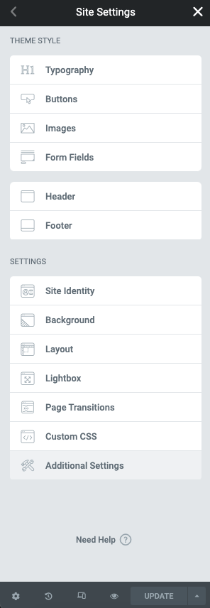
Note: In order to use Page Transitions on existing websites, they first must be activated by navigating to Elementor > Settings > Experiments. Page Transitions will be activated by default on new installations.
Page Transition Styles
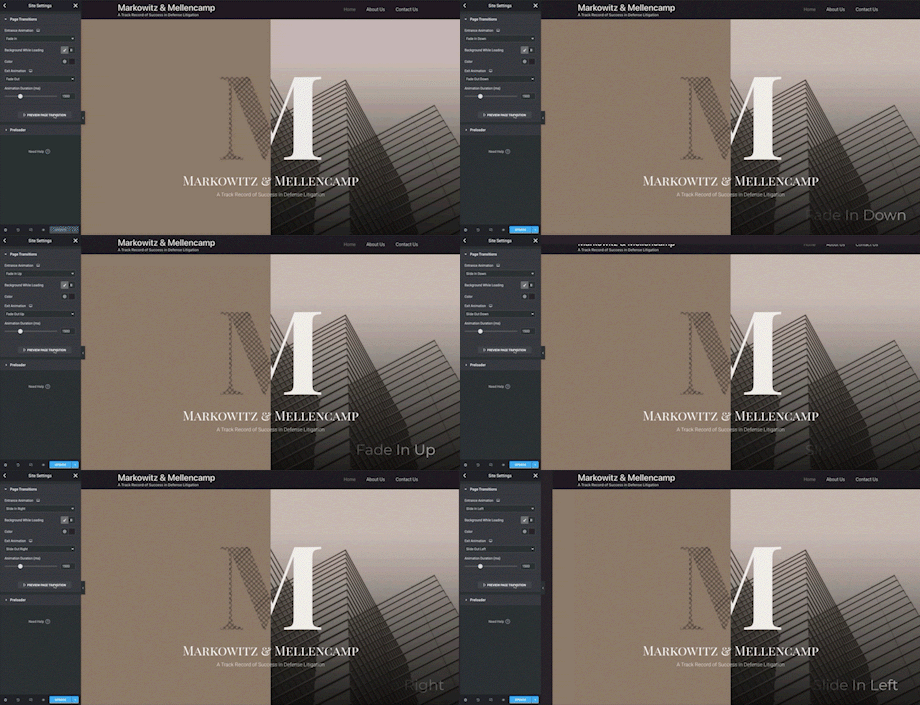
You may easily change the animation effects of your page transition styles in the controls below. Try mixing transition styles on the entrance and exit for a greater visual effect.
Controls
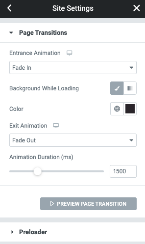
- Entrance Animation – From the dropdown menu choose the entrance animation you wish to use from the following Fade In, Fade In Down, Fade In Right, Fade In Up, Fade In Left, Zoom In, Slide In Down, Slide In Right, Slide In Up, or Fade In Left
- Background Color While Loading – From the choose a solid background or gradient. If neither are selected, the page transition will be transparent
- Color – From the color picker options select the solid color or gradient colors to be used
- Exit Animation – From the dropdown menu choose the entrance animation you wish to use from the following Fade Out, Fade Out Down, Fade Out Right, Fade Out Up, Fade Out Left, Zoom Out, Slide Out Down, Slide Out Right, Slide Out Up, or Fade Out Left
- Animation Duration – Set the amount of time in milliseconds you wish for the transition by using the slider or tying the value into the input field.
Preloader
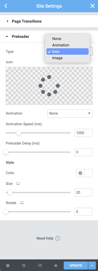
Type Options
From the Type dropdown menu choose the following options None, Animation, Icon, or Image
If Animation Is Selected:
- Animation – From the dropdown menu select between Circle, Circle Dashed, Bouncing Dots, Pusing Dots, Pulse, Overlap, Spinners, Nested Spinners, Opposing Nested Spinners, Opposing Nested Rings, Progress Bar, Two Way Progress Bar, Repeating Bar
- Animation Duration (ms) – Use the slider or manually enter the value in the field.
- Preloader Delay (ms) – Use the slider or manually enter the value in the field
Style
- Color – From the Color Picker select the color desired for your animation
- Size – Change the size of your animation by using the slider or manually entering the value in the field
If Icon Is Selected
- Icon – Select an Icon from the icon library or upload your own SVG
- Animation – From the dropdown menu select from the following options Spinning, Bounce, Flash, Pulse, Rubber Band, Shake, Head Shake, Swing, Tada, Wobble, or Jello
- Animation Duration (ms) – Use the slider or manually enter the value in the field
- Preloader Delay (ms) – Use the slider or manually enter the value in the field
Style
- Color – From the Color Picker select the color desired for your animation
- Size – Change the size of your animation by using the slider or manually entering the value in the field
If Image Is Selected
- Image – Select an Image from the media library or upload your own
- Animation – From the dropdown menu select from the following options Spinning, Bounce, Flash, Pulse, Rubber Band, Shake, Head Shake, Swing, Tada, Wobble, or Jello
- Animation Duration (ms) – Use the slider or manually enter the value in the field
- Preloader Delay (ms) – Use the slider or manually enter the value in the field
Style
- Width – Change the width size of your image by using the slider or manually entering the value in the field
- Max Width – Change the maximum width size of your image by using the slider or manually entering the value in the field
- Opacity – Change the opacity level of your image by using the slider or manually entering the value in the field
Disabling Page Transitions
By default, page transitions apply to all internal links on the page. Clicking a link will start the transition process.
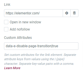
You can disable the transition on selected links, by adding the `data-e-disable-page-transition` attribute. This attribute will disable the transition functionality for that specific link.
To add an attribute to a link, click the cog icon to expand the Link Options, then under the Custom Attributes add the attribute:
