Popups are call to action modal windows that popup and overlay the page at a specified moment or under specific triggers and conditions. Popups are designed to focus a user’s attention once they have taken an action.
To begin, go to Templates > Popups. Control the layout, conditions, rules and styles of the popup,and then design the popup content.
Note: Click the Popup Settings gear icon in the panel’s bottom toolbar to edit the popup settings. ![]()
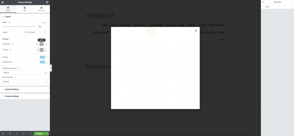
Design Popup
Settings
Layout
- Width: Set the exact width of the popup, using either px or vh
- Height: Set the exact height of the popup, using either px or vh. Use 100vh for both width and height to create full-screen popups
- Horizontal: Choose the horizontal position of the popup, from Left, Center or Right
- Vertical: Choose the vertical position of the popup, from Top, Center, or Bottom
- Overlay: Show or Hide the background overlay
- Close Button: Choose to Show or Hide the Close button
- Show Button After x seconds (if Show Close Button was chosen): Select the number of seconds to wait before showing the close button
- Entrance Animation: Choose the popup’s entrance animation such as fade and zoom from the dropdown selections. Choose any animation effect to preview the effect.
- Exit Animation: Choose the popup’s exit animation such as fade and zoom from the dropdown selections. Choose any animation effect to preview the effect.
- Animation Duration: Set the length of time for animation, in milliseconds
General Settings
- Title: Enter the title of popup. This title will only show on the backend, not to the user.
- Status: Draft, Pending Review, Private, or Published
Preview Settings
- Preview Dynamic Content as: Choose from any Archives, Pages, Posts, Media, or 404 pages.
Note: To see the content you’ve chosen, you must reload the page after selecting the dynamic content.
Style
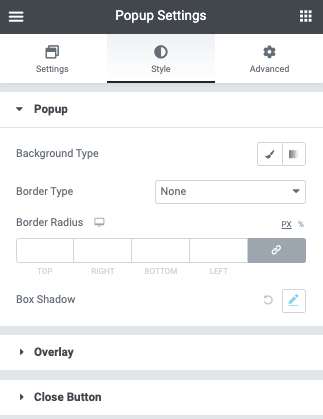
Popup
- Background Type: Choose a background color, image, or gradient
- Border Type: Select the type of border, choosing from none, solid, double, dotted, dashed, or grooved
- Border Radius: Set the border radius to control corner roundness for each side of the popup
- Box Shadow: Adjust box shadow options
Overlay
- Background Type: Choose a background color, image, or gradient
Close Button
- Position: Choose to display the Close button on the Inside or the Outside of the popup
- Vertical Position: Use the slider to select the vertical position of the Close button
- Horizontal Position: Use the slider to select the horizontal position of the Close button
Normal | Hover
- Color: Select the color of the Close button for both the Normal and Hover states
- Background Color: Choose the background color of the Close button for both the Normal and Hover states
- Size: Set the size of the close button
Advanced
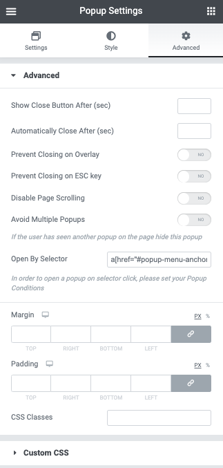
Advanced
- Show Close Button After (sec): Enter a number of seconds. The close button will only appear after that time has passed.
- Automatically Close After (ms): Enter the number of ms to wait before automatically closing the popup. Leave blank to disable automatic close.
- Prevent Closing on Overlay: Select Yes to prevent users from being able to close the popup by clicking on the overlay.
- Prevent Closing on ESC Key: Select Yes to prevent users from being able to close the popup by pressing the ESC key.
- Disable Page Scrolling: Select Yes to prevent users from scrolling the page shown behind the popup
- Avoid Multiple Popups: If the user has seen another popup on the page he visits, hide this popup by selecting Yes
- Open By Selector: Enter a list of selectors that will manually trigger the popup (CSS IDs, classes or data-elements). See instructions
- Margin: Adjust the margins
- Padding: Adjust the padding around the popup
- CSS Classes: Add your custom class without the dot (e.g. my-class)
Custom CSS
Custom CSS: Enter your own CSS
Control Popup via Publish Settings
Set Conditions
Conditions allow you to set on which pages of your website the popup will appear.
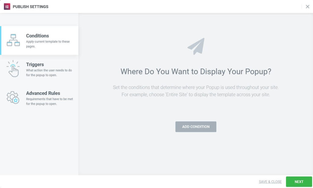
Set the conditions that determine where your popup is used (excluding manual triggering). For example, add an Include condition and choose Singular > Front Page to only show the popup on the site’s home page. Learn more about Conditions.
Set Triggers
Triggers are the user actions that cause your campaign to popup. Select Yes or No for each option that will cause the popup to occur.
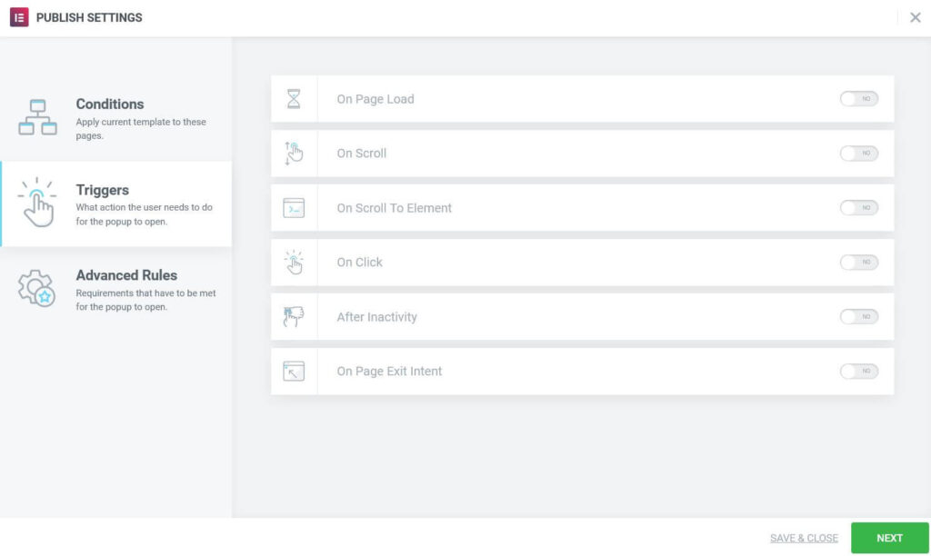
- On Page Load: If set to Yes, set the number of seconds to wait, upon page load, before popup is triggered.
- On Scroll: If set to Yes, select direction (Up or Down) and the amount to scroll before popup is triggered. Down scroll is based on the percentage of the page scrolled down; Up scroll is based on the number of pixels scrolled up.
- On Scroll To Element: If set to Yes, enter the Selector name (CSS ID) that will trigger the popup when user scrolls to it. You must add the CSS ID to the Advanced tab of the element as well.
- On Click: If set to Yes, enter the number of clicks that will trigger the popup
- After Inactivity: If set to Yes, enter the number of seconds of user inactivity that will trigger the popup.
- On Page Exit Intent: Set to Yes to trigger the popup when user’s mouse activity indicates intent to exit the page
Advanced Rules
Advanced Rules specify other requirements that must be met to generate a popup.
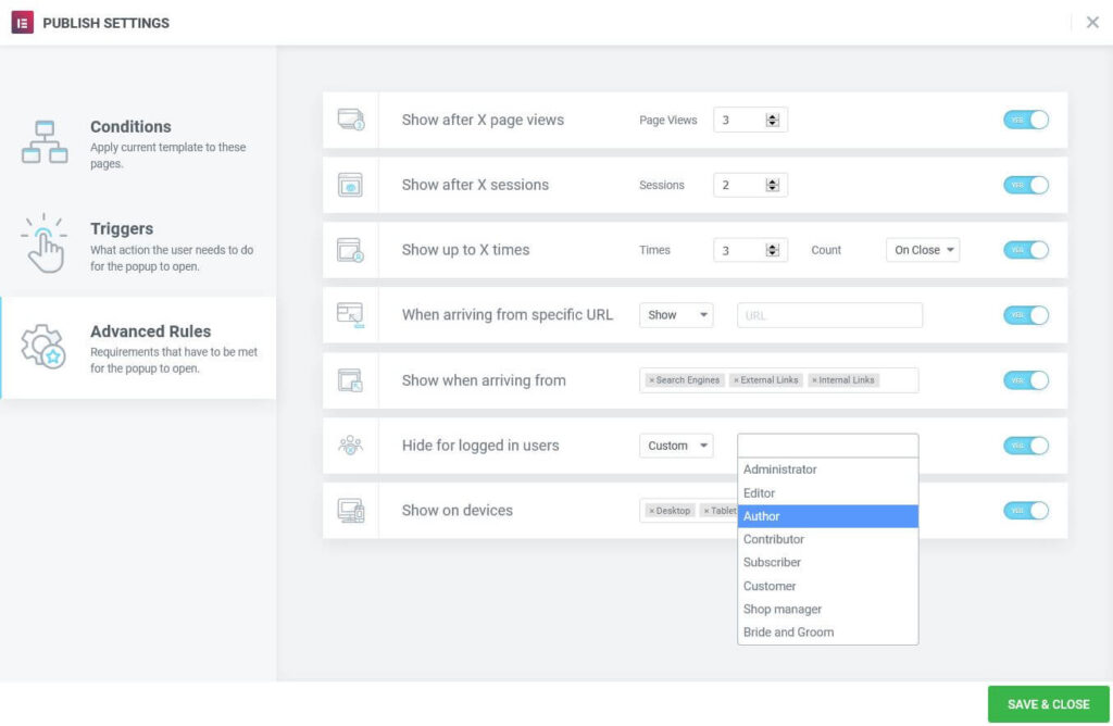
- Show after X page views: If set to Yes, set the number of page views before popup is triggered.
- Show after X sessions: If set to Yes, set the number of user sessions before popup is triggered (a session starts when the user visits the website and ends when the user closes the browser).
- Show up to X times: Max times the popup will be displayed. If Count is set to On Open, this will only allow the popup to open as many times as the number set. If Count is set to On Close, the popup will only open until the user has closed it for the Xth time, after which it will not open again. This setting is set in the Local Storage and will remain there until deleted.
- When arriving from specific URL: If set to Yes, Show or Hide the popup if a user arrives from a specific URL (enter the specific URL). Regex is an option for advanced users to set advanced rules for matching URL patterns.
- Show when arriving from: If set to Yes, show if user arrives from search engines, an external link (enter URL of specific link) and/or an internal link (enter URL of specific link).
- Hide for logged in users: Set to Yes to hide popup for all logged-in users or from select custom roles. For websites with cache, this feature might not work properly
- Show on devices: Set to Yes to choose to show on Desktop, Tablet, and/or Mobile devices
Note: Popups cannot be displayed more than once if the page is not reloaded or re-entered.
Control Popup Via Manual Triggering
Popups can be triggered manually. Dynamic links can use the Popup Action to open or close a Popup. Form can use the Actions After Submit option to open or close a Popup. Any element can use a unique selector (class, ID or data-element) to manually trigger a popup when that element is clicked.
- From any link element, choose Dynamic > Actions > Popup. Click Popup to select either Open Popup or Close Popup. If Close Popup is chosen, the option, “Don’t Show Again” will become an available option.
- From an Elementor form, choose Actions After Submit > Add Action > Open Popup or Close Popup
- From a Custom Selector: Any element can have a selector set which can be used as a manual popup trigger. Edit the element and go to Advanced > CSS Classes (or CSS ID) and give the element a class name (without the preceding dot) or ID name (without the preceding #). In the popup’s Conditions, choose the page that includes the element with the unique selector (e.g. Conditions > Include > Singular > Pages > Your Page Title). When a users visits that page, and clicks on the element, the popup will trigger. This is useful for opening a popup from a theme’s navigation menu item, content within a Text Editor widget, from a non-Elementor element or script, etc.
When triggering a popup from a custom selector, please note that the element doesn’t have to be a “link”. A normally non-clickable element, such as plain text, can be clicked to generate the popup as well. Also note that the Triggers and Advanced Rules will be disregarded while using this option.
