Tabs with nested containers

Tabs widget with nested containers

For users who’ve activated the container and nested elements experiments, (introduced in Elementor 3.10) the Tabs widget has become far more powerful with three major upgrades:

  • Nested elements – Tabs can hold widgets and other elements, allowing you to build complex layouts within an individual tab.
  • Improved tab styling – adjust the layout, positioning, and styling of tabs, including the use of icons in tabs. 
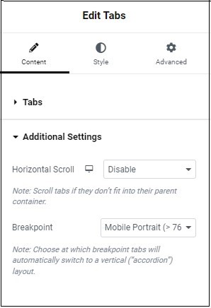
  • Improved responsive settings – Choose at which breakpoint the tabs’ display will turn to accordion style.  

Nesting elements

To use nested elements in tabs:

Tab widget with nested container
A tab widget with a nested container.
  1. Drag the Tabs widget to the canvas
  2. Select an element and drag it to the tab – in this example we’ll place a Text Editor widget in a tab.
A tab widget with a nested text editor widget.

Now, let’s try for something a bit more complex for tab #2 – a tab with a heading, an icon box and a countdown- aligned in a row. 

  1. Click Tab #2.
  2. Drag a container into tab #2
  3. In the container settings, change the direction to row.
  4. Click the widget button.


  5. Drag the Heading widget to the tab’s container.
  6. Click the widget button and drag the Icon Box widget to the container in the tab.
  7. Click the widget button and drag the Countdown widget to the container in the tab. Your tab should look something like this (you may have to adjust the widget sizes):
A tab with three nested elements - A Heading widget, A Countdown widget and an Image widget.
A tab with three nested elements – A Heading widget, An Icon Box widget and a Countdown widget.

Check here for more information about how many containers you should be using.

Nested Tabs Settings

Learn how to add content and style to your nested tabs.

Content - Tabs

In the Content tab, expand the Tabs section to configure what appears in your tabs. 

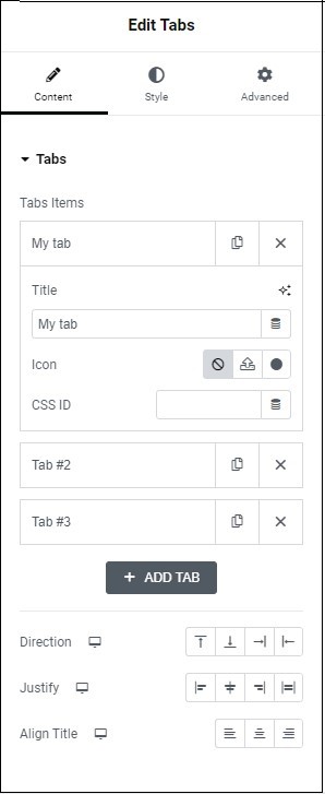
 Tabs that make up the widget. 

  • Click the copy icon () to copy a slide. 
  • Click the delete icon () to delete a slide.

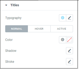
Enter the tab name here. Set the size, font, and color with typography.

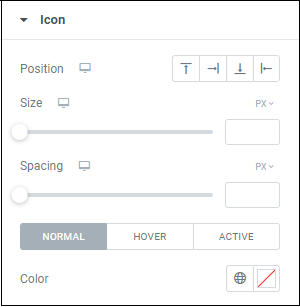
Add icons to the title of your tab.  

  • (default):  select this if you do not want any icons to appear. 
  • : select this to upload an svg icon
  • :  select this to open the icon library 

Selecting option 2 or 3, opens a sub-menu that allows you to choose a 2nd icon that appears when clicking the tab.  

If you did not add a title, only the icon appears. 

If you did add a title, the icon appears according to the position set in the Styles tab (see below).

Tag individual elements on a page. This allows you to link to this specific element.

 Create a new tab.

Set the direction of the tabs to either column or row.


Note: If you set the direction to row, a slider appears allowing you to adjust the width of the tabs in either PX or %


You can also  adjust the alignment of the text/icon tab title to the right, left or center.

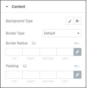
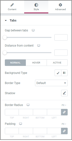
Determines the spacing between items in the container and the items’ distance from the container’s border.

Places the title of the tab at the right, left or center of the tab.

Content - Additional Settings

In the Content tab, expand the Additional Settings section to determine your tab’s layout and responsive settings.

When you add more tabs than are visible on screen, the new tabs are added below the existing tabs.

Enable Horizontal Scroll to place these additional tabs next to the existing tabs, and not below them. Visitors must scroll horizontally in order to access these tabs.

In mobile and tablet view, by default, if using a smaller screen, tabs automatically appear vertically to accommodate the smaller screen. 

From the Breakpoint menu, select either the breakpoint breakpoint for when the visitor is using a mobile (less than 767 pixel wide screen) or for a tablet (less than 1024 pixel wide screen).  

Choose None  to disable this feature. This means that visitors wil scroll horizontally to see all the tabs(not recommended).

Style - Tabs

In the Style tab, expand the Tabs section to configure how the tabs appear. 

Use the slider or the number field to adjust the distance between tabs. For details, see  System Measurements.

 Use the slider or the number field to adjust the space between the title of the tab and the contents of the tab. For details, see System Measurements.

  • Normal: (default) determine how the tabs appear.
  • Hover: (optional)determine how the tabs appear when you hover over them.
  • Active: (optional) determines how the tabs appear when selected. 

If you selected Hover, an additional setting appears called Transition Duration. In this setting, determine how long it takes for the color of the tab to gradually change.  

Choose a background. For details, see Backgrounds.

Choose a border type. For details see, border types.

Add texture to your text with shadow. For details, see Shadows.


Note: If you set the direction to row, a slider appears allowing you to adjust the width of the tabs in either PX or %


You can also  adjust the alignment of the text/icon tab title to the right, left or center.

Make the corners of your element round  Learn more about border radius.

Add padding. For details, see Padding and margins.

Style - Titles

In the Style tab, expand the Titles section to configure how the tab titles appear. 

Choose how your text will appear to visitors. For details, see Typography.

  • Normal:  determine how the dots appear by default. 
  • Hover: determine how the navigation  appears when you visitors hover over them. 
  • Active: determines how the tabs appear when selected.

Choose a color: either use the color picker or a global color.

Add texture to your text with shadow. Learn more about Shadows.

Color the outline of your text and images. Learn more about Text Stroke.

Style - Icon

In the Style tab, expand the Icon section to configure how icons appear. 

Determines whether the tab’s icon will be above, under, to the right or left of the tab title.

Use the slider or the number field to increase and decrease the size of the icon. Learn more about System Measurements.

Use the slider or the number field to increase and decrease the area between the tab’s name and the icon. Learn more about System Measurements.

  • Normal:  determine how the dots appear by default. 
  • Hover: determine how the navigation  appears when you visitors hover over them. 
  • Active: determines how the tabs appear when selected.

Choose a color: either use the color picker or a global color.

Style - Content

In the Style tab, expand the Content section to configure how the area below the tabs appears. 

Choose a background. For more Learn more about Backgrounds

Choose a border type to surround your element. Learn more about Border Types.

Make the corners of your element round. Learn more about Border Radius.

Add padding, for details, see Padding and margins.

在社交網絡上分享它

今天開始使用Elemenor

加入數百萬專業人士,使用Elementor更快、更好地構建WordPress網站

本頁內容