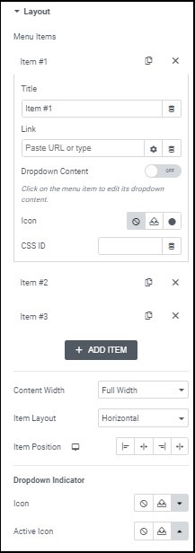
Edit and create menu content.
Copy this menu item. Using copy helps maintain consistency in your menu.
Delete this menu item.
Name this part of your menu.
Direct this menu item to a specific URL. You can give these links custom attributes and make them dynamic. Learn about custom link attributes. Learn more about dynamic content.
Dropdown content appears under menu items when visitors click or hover over them.
Places an icon next to the menu item. Learn more about icons.
Determines the size of the content area below the menu item. There are two choices - Full Width and Fit To Content. Full width will take up the full screen size no matter what content the area contains and Fit To Content will adjust the content area according to what you’ve included in the area. This setting applies to the entire widget, at this time menu items cannot have their own content width options.
Choose Horizontal to have your menu laid out from side-to-side and Dropdown to have it go up and down. Horizontal tends to be good for desktop layouts while dropdown is better for tablets and mobile. If you choose dropdown, visitors will not see names of the menu item, rather they will see an icon representing the dropdown. You can select the icon in the Menu Toggle section.
Determines where the menu will be aligned. Horizontal menus can be right aligned, left aligned, centered, or stretched across the entire width of the widget; Dropdown menus can be right aligned, left aligned, or centered.
Multilevel menu (e.g. if you have an item About Us and under that, sub items for each department), are indicated by an icon.
This setting determines how your icon will appear, both by default (Icon) and when it is selected (Active Icon). This setting is not connected to the icon used if you choose dropdown as your Item Layout.
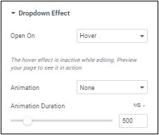
Allows you to choose when the dropdown menu will activate, when you select it (Click) or when you mouse over it (Hover).
You can choose to have your dropdown slowly appear. If you do, Animation Duration determines the amount of time it will take for the dropdown to fully appear.
If you select a dropdown layout, this section controls how the icon representing the dropdown will appear.
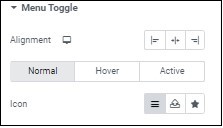
Sets the icon representing the dropdown to the right, left or center.
This is how the icon will appear by default.
This is how the icon will appear when a visitor mouses over it.
This is how the icon will appear when a visitor mouses over it.
This is how the icon will appear when a visitor clicks on it.
Learn more about icons.
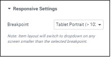
Best practice is to use a more compact menu for mobile and/or tablets. This setting allows you to set whether the compact menu will trigger for tablets and mobile or just mobile.
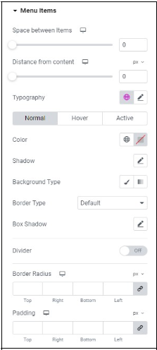
Controls how the content of your menu is displayed
Use the slider to controls the amount of room between the items in your menu
Use the slider to control how far the distance between the menu and content area.
Learn more about typography.
How the typography will appear by default.
How the typography will appear when visitors hover over it.
How the typography will appear when the item is selected.
To choose a color, either use the color picker or a global color.
Learn more about shadows.
Learn more about backgrounds.
Learn more about border types.
Learn more about shadows.
The border radius tool allows you to adjust the shape of elements by rounding their corners.
There are two types of border radius controls – slider and counter.
- To adjust the radius with a slider control, slide the control back and forth until you have the desired effect.
- To adjust the radius with the counter control, use the four counters to adjust each individual corner.
Depending on the element, these measurements can be based on percentage, pixels, or other measurements. Learn more about these measurement methods.
Learn how to create space with padding and margins.
Divider - places a horizontal divider between menu items. After you add a divider, define the divider settings :
- Style (Solid, Double, Dotted, Dashed)
- Width
- Height
- Color
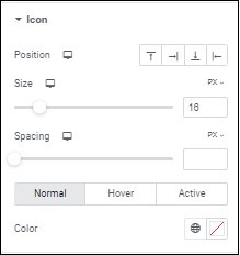
Determines if the icon next to the menu item will be located to its right, left, top or bottom.
Use the slider to increase and decrease the size of the icon next to the menu item.
Use the slider to increase and decrease the size of the icon next to the menu item.
How the icon will appear by default.
How the icon will appear when visitors hover over it.
How the icon will appear when the item is selected.
To choose a color, either use the color picker or a global color.
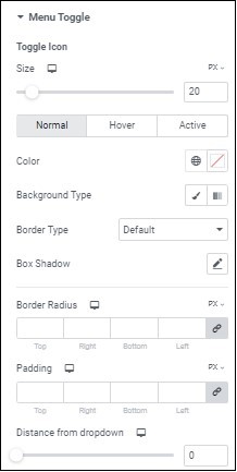
Use a slider to control the size of the toggle visitors click to open the menu.
How the toggle will appear by default.
How the toggle will appear when visitors hover over it.
How the toggle will appear when the item is selected.
To choose a color, either use the color picker or a global color.
Learn more about backgrounds.
Learn more about border types.
Learn more about shadows.
The border radius tool allows you to adjust the shape of elements by rounding their corners.
There are two types of border radius controls – slider and counter.
- To adjust the radius with a slider control, slide the control back and forth until you have the desired effect.
- To adjust the radius with the counter control, use the four counters to adjust each individual corner.
Depending on the element, these measurements can be based on percentage, pixels, or other measurements. Learn more about these measurement methods.
Learn how to create space with padding and margins.
The amount of space between the toggle and the menu.
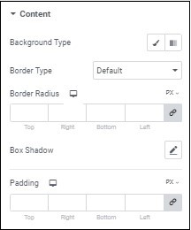
Learn more about backgrounds.
Learn more about border types.
The border radius tool allows you to adjust the shape of elements by rounding their corners.
There are two types of border radius controls – slider and counter.
- To adjust the radius with a slider control, slide the control back and forth until you have the desired effect.
- To adjust the radius with the counter control, use the four counters to adjust each individual corner.
Depending on the element, these measurements can be based on percentage, pixels, or other measurements. Learn more about these measurement methods.
Learn more about shadows.
Learn how to create space with padding and margins.